HPE (Hewlett-Packard Enterprise)
A global edge-to-cloud company focused on transforming businesses by enabling organizations to connect, protect, analyze, and act on their data and applications from the edge to the cloud.
Overview
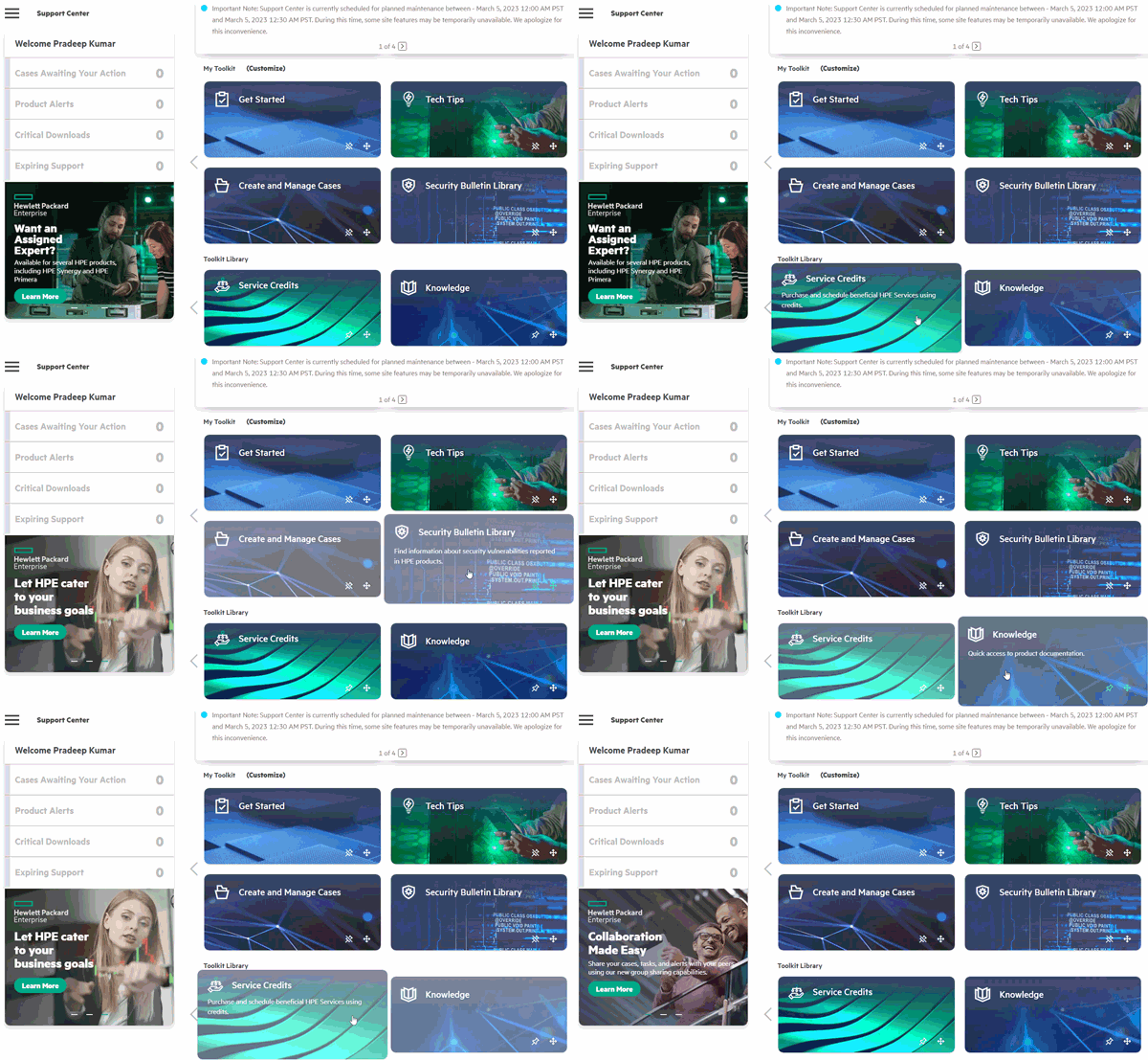
At Hewlett-Packard Enterprise (HPE), I enhanced user experience by creating a comprehensive Notifications feature and contributing to the evolution of the Design System.
My responsibilities included:
Designing user-centric notifications.
Updating and creating design system components.
Collaborating across various product sessions to ensure a cohesive and competitive user experience.

My Role
As a UX Designer at HPE, I:
Created the Notifications Feature: Designed a scalable notifications system to improve user engagement and information accessibility.
Contributed to the Design System Team: Developed new components and refined existing ones, ensuring consistency and usability across the platform.
Collaborated Across Teams: Worked closely with product managers, developers, and other stakeholders to align design efforts with business goals and user needs.
Conducted Competitor Analysis: Performed extensive research on competitors to inform design decisions and ensure our solutions were best-in-class.
Process
Research and Discovery
Conducted user interviews to understand pain points and preferences regarding notifications.
Analyzed competitors' notification systems to identify strengths, weaknesses, and opportunities for differentiation.
Ideation and Conceptualization
Brainstormed and sketched multiple notification system concepts.
Collaborated with the design team to refine and align ideas with HPE's design language and user needs.
Design and Prototyping
Created wireframes and interactive prototypes.
Designed notification components that were flexible, accessible, and visually aligned with HPE's brand guidelines.
Testing and Validation
Conducted usability testing sessions to gather feedback on the prototypes.
Iterated on the design based on user feedback and testing results.
Implementation and Handoff
Worked closely with developers to ensure accurate implementation of the design.
Provided detailed design specifications and supported the development team throughout the build process.
Iteration and Improvement
Monitored the performance and user feedback of the notifications feature post-launch.
Made necessary adjustments and improvements to enhance user satisfaction and engagement.
Key Challenge
Ensuring Consistency: Balancing the need for a cohesive design system with the unique requirements of the notifications feature.
User Engagement: Designing informative and engaging notifications without being intrusive or overwhelming.

Outcomes
Increased User Engagement: The new notifications system significantly increased user engagement and timely information access.
Enhanced Design Consistency: Contributions to the design system ensured a more consistent and user-friendly experience across the platform.
Positive Feedback: Received positive feedback from both users and stakeholders, highlighting the usability and effectiveness of the new features.
Conclusion
This project allowed me to apply my UX design skills and emphasized the importance of cross-functional collaboration and iterative design. By combining user research, competitive analysis, and a user-centred design approach, we successfully enhanced the overall user experience at HPE.
Working on the Notifications feature and contributing to the Design System at HPE was an enriching experience. It allowed me to impact a large user base positively and reinforced my belief in the value of user-centric design.
Tools Used: Axure RP, Figma, Photoshop, and Illustrator.
Skills Applied: User Research, Wireframing, Prototyping, Competitor analysis, Design Systems, Cross-functional Collaboration


