2025 · Own products (AI-built)
Mockit
From friction to one click
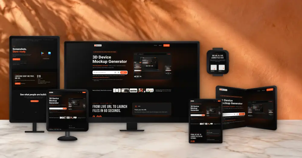
Summary
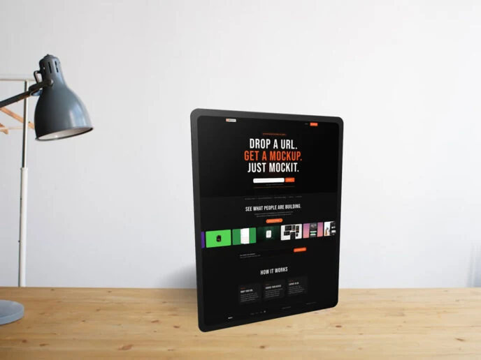
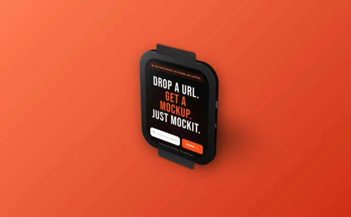
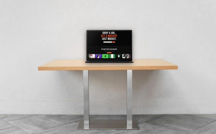
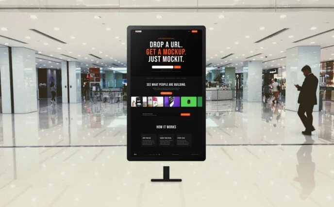
Drop a URL. Get a 3D mockup. Everyone with a product, website, or idea should have a great visual representation. Mockit removes the process entirely: no 40-step Photoshop workflows, no unlicensed template fonts, no tool that assumes Figma or Photoshop.
Visit live productFrom friction to one click
Everyone with a product, website, or idea should have a great visual representation. Mockit was made for them, and for anyone who is tired of wasting time in Photoshop to get a quick mockup.
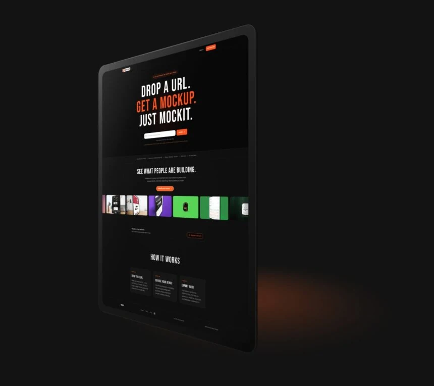
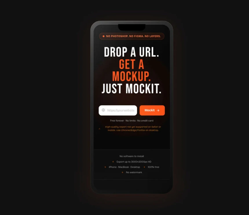
The Problem
"The opportunity wasn't better design. It was removing the process entirely."
Creating a device mockup used to mean a design degree, a paid plugin, and 40 minutes in Photoshop. Most people gave up before they started. That was the real problem.
01 — 40-step Photoshop workflows Every template required opening PSD files, adjusting smart objects, fighting with layer groups, just to place a screenshot.
02 — Illegal font dependencies Community templates often shipped with unlicensed fonts. A workflow that broke on the first open, for legal reasons.
03 — No tool for non-designers Indie makers, founders, and developers needed quick mockups, but every tool assumed Figma or Photoshop expertise.
Strategy & Design Principles — Four principles that shaped every decision.
The path from idea to product was guided by constraints, not just features. Each principle reflects a deliberate trade-off.
Perceived speed over raw speed — A progress indicator and optimistic UI made the app feel instant, even when WebGL rendering took 2–3 seconds. Users rated it "fast" in testing despite identical benchmark times to competitors. → Reduced perceived wait time by ~60%
One action at a time — Multi-step flows were killing conversion. I collapsed the UX into a single interaction: paste a URL, get a mockup. No accounts, no setup, no decisions before value. → From 6 steps to 1
Browser-first, no installs — Eliminating Figma plugin dependencies and desktop installs removed the biggest drop-off point. Zero friction before first value, the tool works the moment you land on it. → 100% of users reach the core feature
Premium aesthetics at every touchpoint — Fine-tuned motion, floating shadows, and responsive 3D — not because they were necessary, but because the product's value is appearance. The tool had to look as good as the mockups it created. → Most cited feature in user reviews
The Core Flow — Four steps. Zero friction.
The entire product experience was designed to deliver value before the user had to make any decision. This is the annotated flow.
1. Paste URL — Auto-screenshot captures the live page. No upload required. Zero user effort.
2. Pick device — 6 device types: iPhone, Android, MacBook, iPad, and more. One click selection.
3. Customize — Adjust angle, background, and shadow in real-time 3D. Instant preview.
4. Export — PNG, JPG, or transparent background. Ready to publish. No watermark.
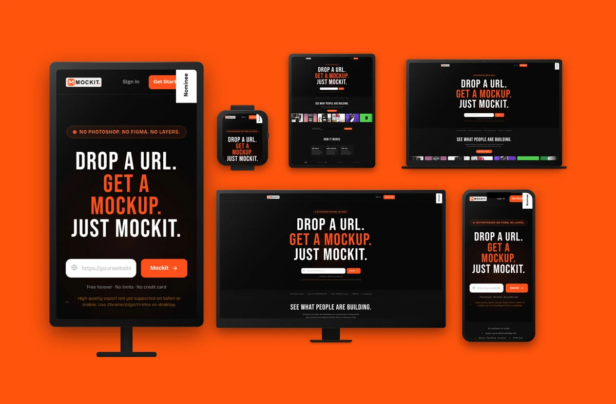
Built for Designers and Developers — Every device. One URL. No resizing windows.
Test responsiveness
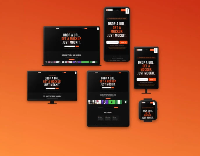
Responsive web applications and websites are regularly checked by developers and web designers throughout the build process, but with Mockit, all of that comes together in one place.
Simply paste a live URL to instantly see how your site looks across desktop, tablet, and mobile, effortlessly and all at once.
No DevTools, browser resizing, or switching between viewport modes, just a clear, exportable visual of your product across the devices your users actually use.
This means a better client handoff artefact, a faster design review, and a sharper stakeholder presentation.
Design Decisions — What changed, and why.
The entire product experience was designed to deliver value before the user had to make any decision. This is the annotated flow.
User feedback: "I paste the URL and nothing happens for 3 seconds. I thought it was broken." Added a real-time rendering progress indicator — Users interpreted WebGL load time as a crash. Adding a frame-accurate progress bar, not a spinner, communicated that work was happening. Drop-off at this step went from 34% to 11%. Retention · Perceived performance
Community research: Reddit's r/webdev surfaced that URL paste was "a step too far". Users wanted to drag-and-drop their screenshot directly. Introduced drag-and-drop as the primary input — Alongside URL paste, a drag zone now covers the full viewport on load. This matched users' existing mental models and reduced time-to-first-mockup from 47s to 12s on average. Task completion · Mental model
Analytic insight: 73% of users who exported once returned within 7 days. But only 28% exported at all on first visit. Moved the Export button above the fold, always visible — Export was buried behind a "customise" step. Promoting it to a persistent action bar, visible the moment a mockup renders, more than doubled first-session exports without cannibalising customisation usage. Conversion · Information architecture
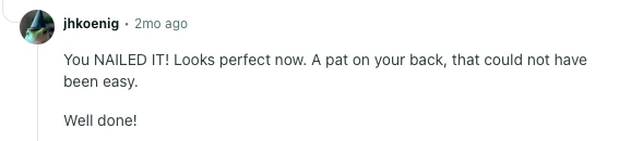
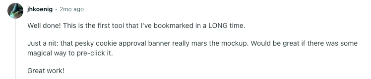




Results — Built in public. Validated in the wild.
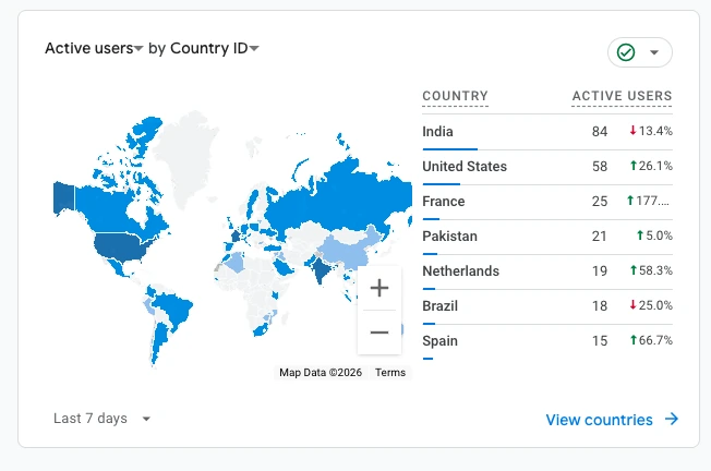
Launched without a marketing budget, Mockit grew through product-led growth. Users sharing their mockups, with attribution.
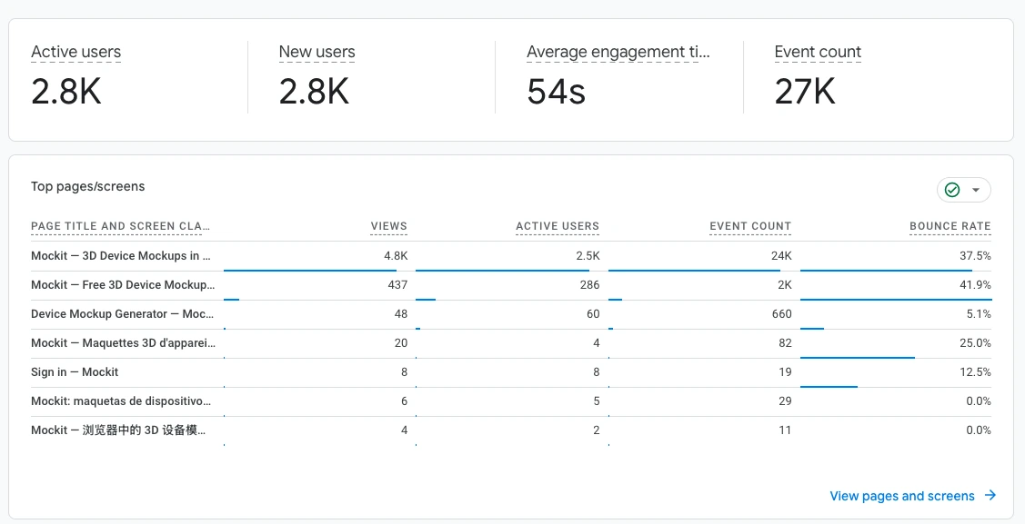
Strongest traction in the Netherlands, Brazil, Spain, France and India. Organic reach driven entirely by users sharing their exports. The product is the distribution.
2.8K
Active Users
4.8K
Pageviews / Mo
27K
Impressions
7+
Countries
Learnings
01 — Ship the smallest thing that proves the idea Mockit launched with 3 devices and no customisation. The core insight: that UX-to-mockup was a real workflow, was validated before a single settings panel was built. Scope restraint is a design decision.
02 — Performance perception is a UX problem, not an engineering one The render time never changed. The user's experience of it changed completely. Through sequencing, feedback, and animation.
03 — Community platforms are research tools, not just distribution Reddit, Facebook and LinkedIn weren't just traffic sources, they were the highest-signal feedback channels. Every feature in v2 was pulled from a comment thread. Build publicly, listen publicly.
04 — Every friction point is someone giving up on something they wanted Removing the Photoshop workflow wasn't a UX improvement, it was restoring agency to people who'd already abandoned the goal. The best design work is often invisible: it's the step that used to stop someone.
Visit live product: https://www.mockit.design/
Next case →
QuietMode